Thursday, 21 February 2013

Animation

I find mannequin's spooky so i looked up Tim Burton who's characters are spooky to look at. These are are a few that interested me: Timothy Walter "Tim" Burton(born August 25, 1958) is an American film director, film producer, writer and artist. He is famous for his dark, gothic, macabre and quirky-themed movies such as Beetlejuice, Edward Scissorhands, The Nightmare Before Christmas, Ed Wood, Sleepy Hollow, Corpse Bride, Sweeney Todd: The Demon Barber of Fleet Street, Dark Shadows and Frankenweenie, and for blockbusters such as Pee-wee's Big Adventure, Batman, its first sequel Batman Returns, Planet of the Apes, Charlie and the Chocolate Factory and Alice in Wonderland.

Wednesday, 20 February 2013

Animation

After discussing it some more on my crit on Tue. I was advised to focus on one of my ideas. As i had too much, and was simular to a tv eposiode. So i decided to discuss on the idea on the mannequin's . Simular to a toy story the mannequins carry out there daily process and comes to life at night. I started researching mannequins - A life-size full or partial representation of the human body, used for the fitting or displaying of clothes; a dummy. . A jointed model of the human body used by artists, especially to demonstrate the arrangement of drapery. Also called lay figure. . One who models clothes; a model. I looked at the female form and the male form seen below: I looked at :

Tuesday, 19 February 2013

Animation

We got our brief on Monday which consists of a 15 second animation. You can use different media and there is no subject matter. That day we had to come up with a script telling the story.Like -He opened the door - i was wrong I came up with my own brief which consisted of the following: -I opened the door, captured looking down showing briefcase ((captured in colour).) -Close up of door being locked ((entering a world of black and white)). -The neighbour who was busy working in his garden stopped suddenly and observed as i entered the car -While passing through the neighbourhood a little boy on the footpath his head followed me as the car passed. -The atmosphere is eerie. -Onlooking from the car, i looked up, saw a cloud darken infront of my eyes. -As i entered the town, the streets which would usually be full of people were now empty you can see the drivers puzzled reaction from the windscreen -I pulled up infront of red lights and observed around me. To my right were shop frontswith manikine's which turned there heads to face me -In a state of shock he turns to his left where he observes a park he focuses on a flower , he see's it decay infront of his eyes. Some of the quick steches i came up with :

Monday, 4 February 2013

Visual Communications Typeography

Some ideas I started thinking clashing colours like: red and hot pink black and dark brown light yellow and bright lime green royal blue and forest green orange and laser green grey and tan gold and orange teal and orangered seafoamgreen and orange pea green and deep purple brown and pukey orange dark gold and orange browny green and red AND HOW COLOURS LIKE BRIGHT GREEN AND BRIGHT RED ARE UNPLEASING TO THE EYE

Saturday, 2 February 2013

Visual Communications

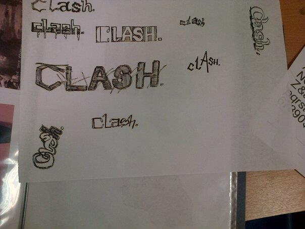
Then we had to come up with two drawing we thought was the strongest that uses the scamper method. On the friday crit we discussed both of my works my two illustrations below didnt illustrate my word cleverly. The image with the babies rattle was effected but it didnt show the word CLASH instead it showed rattle. Which was only an effect of being in a clash.
Im going to look at clashing colors which include : red and hot pink black and dark brown light yellow and bright lime green royal blue and forest green orange and laser green grey and tan gold and orange teal and orangered seafoamgreen and orange pea green and deep purple brown and pukey orange dark gold and orange browny green and red BRIGHT GREEN AND BRIGHT RED-

Visual Communications

In our CCS class on fri the 3rd of Feb we looked at artists that huge influences on graphics these included : -Toulouse Lautrec -Jules Cheret Toulouse Lautrec
They used Female figures to influence the viewer.He captured the effect of the movement of dancers, circus performers, and other entertainers by simplifying outlines and juxtaposing intense colours; the result was an art throbbing with life and energy. His lithographs were among his most powerful works, and his memorable posters helped define the possibilities of the genre. His pieces are often sharply satirical, but he was also capable of great sympathy, seen most poignantly in his studies of prostitutes (e.g., At the Salon, 1896). His extraordinary style helped set the course of avant-garde art for decades to come. Read more: http://www.answers.com/topic/henri-de-toulouse-lautrec#ixzz2Jw7Wm61p Jules Cheret
From 1859 to 1866, he was trained in lithography in London, England, where he was strongly influenced by the British approach to poster design and printing. On returning to France, Chéret created vivid poster ads for the cabarets, music halls, and theaters such as the Eldorado, the Olympia, the Folies Bergères, Théâtre de l'Opéra, the Alcazar d'Été and the Moulin Rouge. His works were influenced by the scenes of frivolity depicted in the works of Rococo artists such as Jean-Honoré Fragonard and Antoine Watteau. So much in demand was he, that he expanded his business to providing advertisements for the plays of touring troupes, municipal festivals, and then for beverages and liquors, perfumes, soaps, cosmetics and pharmaceutical products. Eventually he became a major advertising force, adding the railroad companies and a number of manufacturing businesses to his client list. As his work became more popular and his large posters displaying modestly free-spirited females found a larger audience, pundits began calling him the "father of the women's liberation." Females had previously been depicted in art as prostitutes or puritans. The women of Chéret's posters, joyous, elegant and lively—'Cherettes', as they were popularly called—were neither.

Friday, 1 February 2013

Visual communications

We looked at the SCAMPER way of thinking on Wednesday Class. Edward de bono is best known for this method "Father of Lateral Thinking " Edward de Bono is regarded by many to be the leading authority in the world in the field of creative thinking and the direct teaching of thinking as a skill. He has written 62 books with translations into 37 languages and has been invited to lecture in 54 countries. He is the originator of lateral thinking which treats creativity as the behaviour of information in a self-organising information system - such as the neural networks in the brain. From such a consideration arise the deliberate and formal tools of lateral thinking, parallel thinking etc. S - Substitute C - Combine A - Adapt M - Magnify modify P - Put to other use E - Eliminate or minimize R - Rearrange revearse Much of creative thinking involves combining previously unrelated subjects and creating something new Getting familiarize ourselves with the ideas of others. I looked at my thumbnail sketches and decided i would work with the clashing of cultures vs the clashing colours this illustrated below
Color is the most immediate form of non-verbal communication. We naturally react to colour as we have evolved with a certain understanding of it, partly because the survival of our ancestors depended on it with regard to what to consum or avoid. Color is used to represent thoughts and emotions in a way that no other element of design can. Colours that clash includes RED GREEN or RED and BLUE , RED and Purple. We can see that the combination of RED paired with the other colours are visually unpleasing to the eye. As they both reprents different moods
RED - Is a passionate color of hearts and flames. It attracts our attention and actually speeds up the body's metabolism. Red is popular amoung young and pink in particular is associated with romance. Deep red on the other hand looks aristocratic.
GREEN- green is tranquil and pastrol, the colour of trees and grass. Bright green reminds us of spring and fertility but also the colour of mildew, poison and jelousy. Dark green is an eloquent color, and brings to mind the deep quiet of a pine forest.
BLUE- is the colour of the sky and sea. Like green it has a calming effect, but its also quite powerful- the strongest of the familiar colors after red.Light blue looks young and sporty but royal or navy blue has a dignified wealthy air.
Purple- is sophisticated color, long assosicated with royalty. We dont ofteen see it in nature, so we think of it as "artifal" color and find it a bit hard to take. The lighter shades of purple have dominated women's fashion in recent years. COLOR SYMBOLS IN RELIGION Christanity = WHITE - christmastide trinity ascension easter all saints transfiguration pope innocence joy life triumph purity light holiness of life cleanliness Gold- Divine or celestial light the glory of god. Islam= green suffering of hysayan the grave white- ressurrection