Monday, 29 April 2013
Friday, 19 April 2013
Tuesday, 16 April 2013
Darkroom notes
 One of the most difficult things to learn about black and white darkroom printing is to recognise good from bad prints and know how to make any print into a good print
■Low contrast – it is much easier to make low contrast prints but high contrast gives more striking prints.
■Prints that are too dark from over-exposure - you should usually just be able to see detail in the highlights (light areas) and in the shadows (dark areas).
Enlarger
I have 4 enlargers in my darkroom so that I can run printing courses (usually for 2 people). My main enlarger is a floor standing Durst 139 that I bought second-hand and must be getting on for 40 years old, but is still going strong! However, it has the relatively recent addition of an Ilford MG 500H variable contrast head with two 300 watt lamps to keep exposure times short, and they don’t change over the entire contrast range, typically 3 to 6 seconds at f8 for a 16 x 12 inch image.
Everything is controlled by a key pad with 9 memories for exposure time and grade combinations. It is an ideal set-up for split grade printing since everything can be programmed in.
A footswitch is used to turn it on (or off) and this leaves my hands free to dodge and burn as soon as the lamps are turned on. This just leaves me to worry about the dodging and burning rather than remembering to dial in several different filtration settings (such as on a colour head) to change the contrast.
The other 3 enlargers (Durst 670’s) are all fitted with Ilford under the lens filters. This is the simplest set-up for split grade printing in the absence of a dedicated variable contrast head like the Ilford MG500. Using a colour head and changing filtration for each exposure is possible but very time consuming and error prone compared to using the Ilford filter set.
Test strips
I start by choosing a negative that will be easier to print by having some shadow detail but is not so dense that exposure times are going to be unreasonably long. Then I do some test strips to give me a rough idea of the exposure time that will be needed.
To save time and materials, I usually place one side or end of the strip in a dark area and the other in the highlights. From this I get an idea of times that these areas need, as well as for the main area of the image in between. Then 4 or 5 exposures are made, covering the strip with each successive exposure. Each step exposure is roughly half as much again compared to the previous one, e.g. 4, 6, 8 12, 18 sec. Then a time is selected that shows the correct densities for the main area in the print. To check this before committing to a full sized piece of paper, I often expose another strip for this best time and place it across the highlights and shadows. I may even dodge and burn on this strip if the original test gave me this information.


 Margins
by Paul Seawright
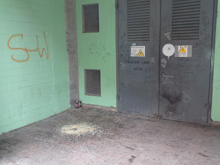
Paul Seawright's landscape photographs from 1997/98 - of the sites of fires burnt on the edges of Belfast housing estates, cages around pubs and walls between communities - began an investigation into peripheral and marginal territory. In this new work he moves away from the overtly political to examine tracts of unspecified land that lie on the edges of many cities. They are uninhaited spaces, places beyond everyday encounter. The police often turn to these places, searching them for missing persons, clues or for criminal evidence.
Monday, 15 April 2013
 David Gepp
At Clotworthy House, Antrim, 1994.
This image of a girl walking out of the frame, slightly soft from selective focusing and her movement against a desolate backdrop of an off licence and shops, has to be one of my personal favourites from the exhibition. Even a cynic like me was touched by the beauty of the girl and the ugliness of the barbed wire that sits along the top of the buildings, and the wind blown plastic bags that have come to rest in the tangle.
Friday, 12 April 2013
Jon Damaschke


 Stunning photo portraits of Chicago by Jon Damaschke
Jon Damaschke is a Chicago animator-turned-photographer whose work blows me away. He has an incredible vintage aesthetic, which is easy to love, and a unique photographic perspective. Considering how amazing his work is, it’s stunning that he’s only been pursuing photography for a few years.
Thursday, 11 April 2013
Wednesday, 10 April 2013
Subscribe to:
Posts (Atom)


